[BUG]s TLB Beta 7.3.4 Text Not scaling on High DPI Display
Started by JTB3


Rate this topic
  • 1 Vote(s) - 5 Average
  • 1
  • 2
  • 3
  • 4
  • 5


4 posts in this topic
JTB3
Junior Member
**


0
30 posts 11 threads Joined: Jan 2014
05-03-2017, 12:15 PM -
#1
Hi Yuri,
Congratulations on getting out the latest 7.3.4 beta release! After loading it on my Dell XPS-15 4K laptop, I'm noticing many problems with the high DPI scaling:

1) Icon text is not scaling at all.
2) Title/separator text is scaling correctly (this is the only text that seems to be the correct size).
3) Separator lines are too thick (over scaled).
4) Standard Windows 'Folder Icons' are still a bit too small (compared to other icons).
5) 'Volume Control' slider/graphics and icons are also not scaling at all.

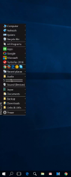
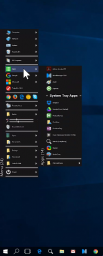
The new beta_7.3.4 is unusable on my system, so I've now reverted back to beta_7.3.3. Here are some example screenshots:

TLB_Beta_v7.3.3 (Before Update)
   

TLB_Beta_v7.3.4 (After Update)
   

TLB_Beta_v7.3.4 (DPI Scale 'Off')
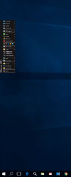
   

I made sure the 'Apply DPI Scale Factor' setting was checked (unchecking it eliminated all scaling, except for the 'Menu Caption' text - perhaps this is another issue?). I did not select (or change) the 'Use default shell sizes' setting.

My Dell is running the latest 64-bit Windows Creators Update.
The window scaling on the laptop screen is set to 225%
My attached screenshots are scaled down due to being captured on a remote desktop connection.

Hope this is helpfull - I'll be looking forward these being (hopefully) fixed in the next beta! -JT Smile
_____________________________
This post was last modified: 05-08-2017, 05:36 PM by JTB3.
[JTB3] My System: Win10 Pro-x64, Intel i7-7700K (Z270) + i7-4771 (Z87)
Dell XPS-15 9550 4K Touch Notebook (225% scaling), 43in LG 4K Monitor (100% scaling)
[Bay Area, California]
Yuri Kobets
Posting Freak
*****


10
6,208 posts 429 threads Joined: Jan 2002
05-08-2017, 06:38 AM -
#2
I've released version 7.3.5 RC1

Quote:1) Icon text is not scaling at all.
version 7.3.5 RC1 fixes this (I hope)

Quote:2) Title/separator text is scaling correctly (this is the only text that seems to be the correct size).
I think this was because of the custom font.

Quote:3) Separator lines are too thick (over scaled).
Not resized screenshot will help Blush

Quote:4) Standard Windows 'Folder Icons' are still a bit too small (compared to other icons).
Please can you post screenshot? The screenshots in your previous post are too resized Sad

Quote:5) 'Volume Control' slider/graphics and icons are also not scaling at all.
I have to adopt all plugins for dpi scaling Blush
The TORDEX Team
http://www.tordex.com
JTB3
Junior Member
**


0
30 posts 11 threads Joined: Jan 2014
05-08-2017, 01:32 PM -
#3
(05-08-2017, 06:38 AM)Yuri Kobets Wrote: I've released version 7.3.5 RC1

Thanks for the quick turnaround on this Yuri! (though I'm surprised you're calling it a release candidate with known bugs still present)

Quote:
Quote:1) Icon text is not scaling at all.

version 7.3.5 RC1 fixes this (I hope)

Yes! The text is now scaling properly - nice job! (see screenshot below)

Quote:
Quote:3) Separator lines are too thick (over scaled).

Not resized screenshot will help Blush

Separator lines are still too fat (I've attached a full-scale screenshot)
Notice in my full-scale screenshot that the separator lines are 6-pixels tall - My Dell XPS-15 notebook screen is scaled at 225%, so I would expect the lines to be (at most) 3 pixels tall, +drop shadow (Note that you can't see the drop shadow in my screenshot because I had to turn off the 'Glass' effect and I've temporarily applied a dark menu background due to the 'Aero Glass' utility not yet being available for the W10 Creators Update)


Quote:
Quote:2) Title/separator text is scaling correctly (this is the only text that seems to be the correct size).

I think this was because of the custom font.

Separator title text looks good now (but the lines, as described above, still remain too thick)

Quote:
Quote:4) Standard Windows 'Folder Icons' are still a bit too small (compared to other icons).

Please can you post screenshot? The screenshots in your previous post are too resized Sad

See in my screenshot that all of the 'system icons' appear just a little too small, as compared to the other app/program icons. Can the scaling of these be tweaked up just a bit? (This is not a huge issue, but it is noticeable to me!)

Quote:
Quote:5) 'Volume Control' slider/graphics and icons are also not scaling at all.

I have to adopt all plugins for dpi scaling Blush

I can appreciate that this is 'a lot' of work! It would be great if you could update at least a few of the more popular/critical ones (like 'Volume Control' and 'Spacer' with the next (RC) update - I'd also love to see the 'News/RSS Reader', 'Timer', and 'Color Picker' plugins updated soon! Smile

Again, many thanks for ALL of your hard work on this update Yuri!
-JT Smile

This post was last modified: 05-08-2017, 01:53 PM by JTB3.
[JTB3] My System: Win10 Pro-x64, Intel i7-7700K (Z270) + i7-4771 (Z87)
Dell XPS-15 9550 4K Touch Notebook (225% scaling), 43in LG 4K Monitor (100% scaling)
[Bay Area, California]
Yuri Kobets
Posting Freak
*****


10
6,208 posts 429 threads Joined: Jan 2002
10-09-2017, 11:33 AM -
#4
Quote:Separator lines are still too fat (I've attached a full-scale screenshot)
Notice in my full-scale screenshot that the separator lines are 6-pixels tall - My Dell XPS-15 notebook screen is scaled at 225%, so I would expect the lines to be (at most) 3 pixels tall
The default size of separators is 2 pixels. So:
2 * 225 / 100 = 4.5
In the next version the size will be 4 pixels for 225% scaling.
The TORDEX Team
http://www.tordex.com
JTB3
Junior Member
**


0
30 posts 11 threads Joined: Jan 2014
10-09-2017, 03:48 PM -
#5
(10-09-2017, 11:33 AM)Yuri Kobets Wrote:
Quote:Separator lines are still too fat (I've attached a full-scale screenshot)
Notice in my full-scale screenshot that the separator lines are 6-pixels tall - My Dell XPS-15 notebook screen is scaled at 225%, so I would expect the lines to be (at most) 3 pixels tall
The default size of separators is 2 pixels. So:
2 * 225 / 100 = 4.5
In the next version, the size will be 4 pixels for 225% scaling.

Hi Yuri, Thanks for your reply.
My prior comment about the separator lines was referring to the 'primary/visible' dimension, which is 1 pixel (not including the drop shadow). So yes, technically the default size of the separators is 2 pixels (including the drop shadow) - so my prior comment is still valid - the visible portion was scaled to 6-pixels and looks proportionally too fat.

My observation in the HDPI scaling of boxes/separator-lines/etc., is that it is better to round 'down' to the nearest pixel, vs up. These items just look more 'bulky' if rounded 'up' - especially without an anti-aliasing algorithm, which can further make thin lines look blurry.

So, in the next version, at 225% scaling (for example), I'd suggest making the primary/visible portion of the separator line = 2 pixels (rounded down, vs 3). You may need to experiment to see if the drop shadow portion still looks good when if scaled at a 1:1 ratio of the primary/visible portion. A slightly thinner drop shadow may look better at higher scalings (e.g. at 300% scaling: visible portion=3 pixels, drop shadow=2 pixels, + 1 px transparent padding added at top to balance).

Hope this feedback is helpful Smile -JT
[JTB3] My System: Win10 Pro-x64, Intel i7-7700K (Z270) + i7-4771 (Z87)
Dell XPS-15 9550 4K Touch Notebook (225% scaling), 43in LG 4K Monitor (100% scaling)
[Bay Area, California]


Forum Jump:


Users browsing this thread: 3 Guest(s)